Today we will continue to tell the story of the logos of our local groups.
Forlì-Bologna
In Greek mythology, Icarus, Daedalus’ son, died while trying to escape from Cretan Labyrinth by means of wings that his father constructed from feathers and wax.
The idea of aviation touched on deep-seated concerns and emotions in the early twentieth century, transcending rational and national boundaries. While fighting, pilots had some control over their fate, which gave them a status above the powerless foot soldiers in the trenches below. One of the most famous of these wartime ‘aristocrats’ of the air, the legendary Red Baron, Manfred von Richthofen, once said:
The glorious thing in the flying service is that one feels that one is a perfectly free man and one’s own master as soon as one is up in the air.
If you look closely at the logo of AS Forlì-Bologna you may see that it represents Icarus, ready to leap off the ground. Now, you may wonder why we decided to design our logo using that specific mythological figure. A momentous marble statue of Icarus celebrates the myth of flight in front of the former College of Military Aeronautics. This was one of Forlì’s most important buildings constructed during the rationalistic architectural period. It was dedicated to the training of future pilots and therefore designed to indoctrinate young aviators and engineers being trained there with the idea of the flying hero, ready to fight.
Pisa
The logo of AS Pisa contains in its design the city’s iconic symbol known worldwide, the Leaning Tower.
The tower is one of three structures in Pisa’s Cathedral Square; it was built around the 12th century and its design is attributed to the architect Diotisalvi who worked on Pisa’s Baptistery.
You may ask “why is it leaning?”. During the construction the ground underneath collapsed (it was too soft to support the weight) causing the tower to lean; the building was finished in the 14th century with an arc shape in order to stabilize it.
München
Munich to a degree like no other large city in Germany is defined by its vicinity to the Alps. On a nice day the mountains can be seen from many of the buildings in the city. To a large number of Munich residents, the mountains and alpine lakes and landscapes are a great getaway from the buzzing city life. This is why we decided to highlight the Alps as a defining characteristic of the Munich logo.
Paris
On the left, there is a simplified representation of the Eiffel Tower, an emblematic element of our city to remind the location of the association.
The continuity of the Eiffel Tower represents the trajectory of the airplane to recall the domain of our association. In the colored version of the logo, this part is blue, white and red and represents the French flag.
Dresden
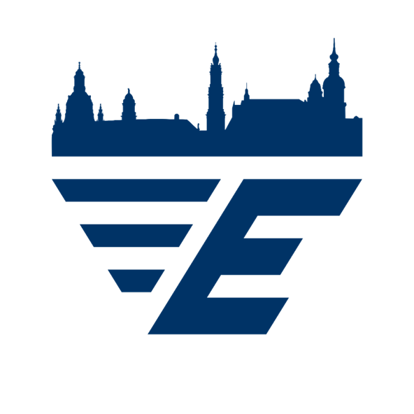
We put the skyline of Dresden´s old town as it would be seen from the banks of the Elbe river on top of the EUROAVIA logo. The rebuilt baroque old town of Dresden is home to many famous churches and towers like the Frauenkirche with its well-known dome.